
Multicolumns
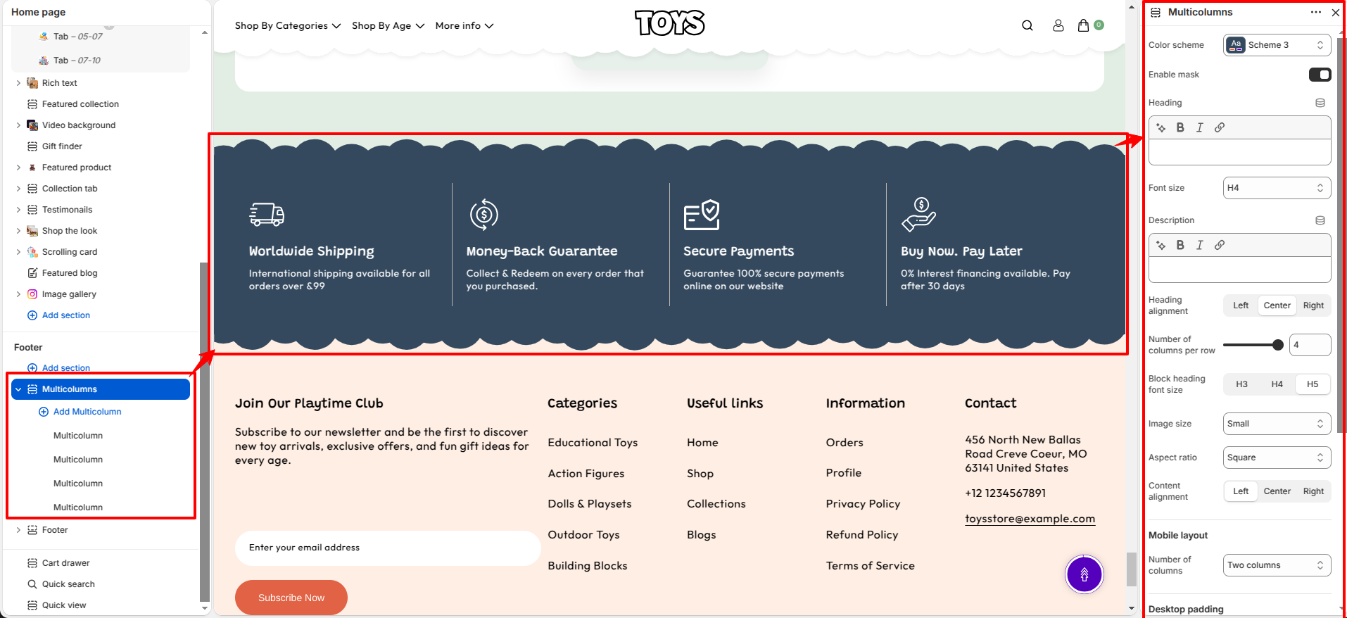
The Multicolumns section in the Soft theme allows you to display multiple content blocks in a clean and organized grid layout. Each column can include an image, heading, text, and optional link, making it ideal for showcasing services, store features, product benefits, categories, or brand highlights.
This flexible section helps present important information in a visually appealing way while maintaining a consistent design across your store. You can customize the layout, typography, spacing, and alignment to match your brand.

Multicolumns Section Settings
This section provides global settings to control the overall appearance and layout:
- Color Scheme – Choose a predefined color scheme for the section (e.g., Scheme 3).
- Enable Mask – Enable or disable an image mask effect.
- Heading – Add the main title for the section.
- Font Size – Select the heading font size (e.g., H4).
- Description – Add supporting text below the section heading.
- Heading Alignment – Choose the heading alignment: Left, Center, or Right.
- Number of Columns per Row – Select how many columns appear in each row on desktop (e.g., 4).
- Block Heading Font Size – Choose the heading size for each column (H3, H4, or H5).
- Image Size – Select the image size (e.g., Small).
- Aspect Ratio – Choose the image aspect ratio (e.g., Square).
- Content Alignment – Align the block content to the Left, Center, or Right.
- Mobile Layout – Choose the number of columns displayed on mobile devices (e.g., Two columns).
- Desktop Padding – Configure the spacing for desktop devices.
- Padding Top – Set the top padding for desktop.
- Padding Bottom – Set the bottom padding for desktop.
- Mobile Padding – Configure the spacing for mobile devices.
- Mobile Padding Top – Set the top padding for mobile.
- Mobile Padding Bottom – Set the bottom padding for mobile.
Multicolumn Block Settings
Each Multicolumn block includes the following settings:
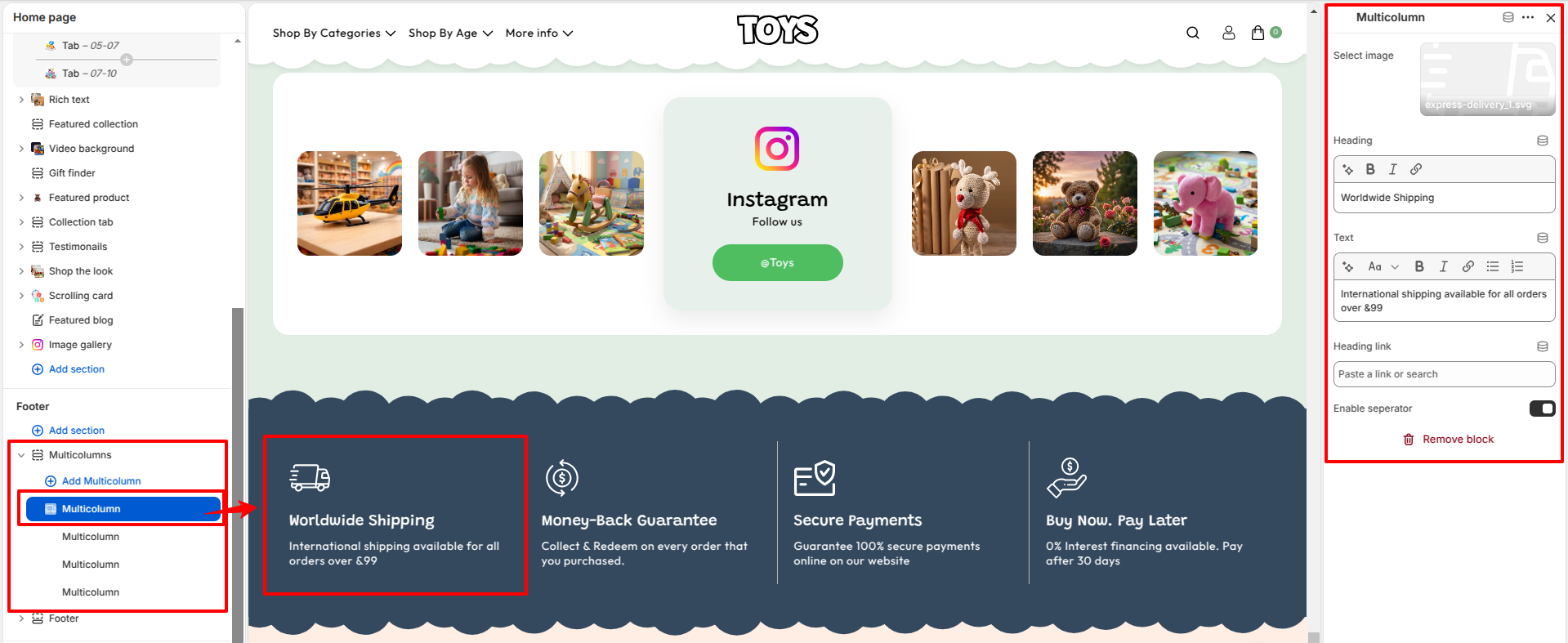
- Select Image – Upload an image to display in the column.
- Heading – Add a title for the column (e.g., "Worldwide Shipping").
- Text – Add a short description below the heading.
- Heading Link – Paste or search for a link to make the heading clickable.
- Enable Separator – Display a separator line between content elements.
Steps
- Open the Theme Customizer from your Shopify admin.
- Navigate to the Multicolumns section on the homepage.
- Configure the section settings such as the color scheme, heading, description, alignment, and number of columns.
- Click Add Multicolumn to create a new block.
- Upload an image for the block.
- Enter the block heading and descriptive text.
- Optionally add a heading link and enable the separator.
- Repeat the process to add additional columns.
- Adjust the layout and spacing for desktop and mobile devices.
- Click Save to apply your changes.
FAQs
Where can I find the Multicolumns section?
The Multicolumns section is available in the Theme Customizer. From Shopify admin, go to Online Store > Themes, click Customize, and locate the Multicolumns section on the homepage template.
How do I add or edit a Multicolumn block?
Open the Multicolumns section in the Theme Customizer, click Add Multicolumn to create a new block or select an existing one to edit. Upload an image, add the heading and text, optionally assign a heading link, enable the separator if required, and click Save.