
Scrolling card
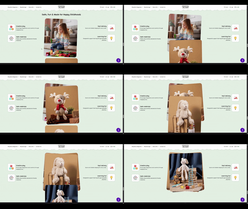
The Scrolling Card section in the Soft theme allows you to present content in a series of visually engaging cards that animate as users scroll through the page. This layout is ideal for showcasing features, collections, product highlights, services, or brand stories in a structured and interactive format.
As visitors scroll, each card smoothly comes into view, creating an engaging browsing experience that helps draw attention to important content. The section makes it easy to organize information while maintaining a modern and dynamic design throughout your store.
Scrolling card Section Settings
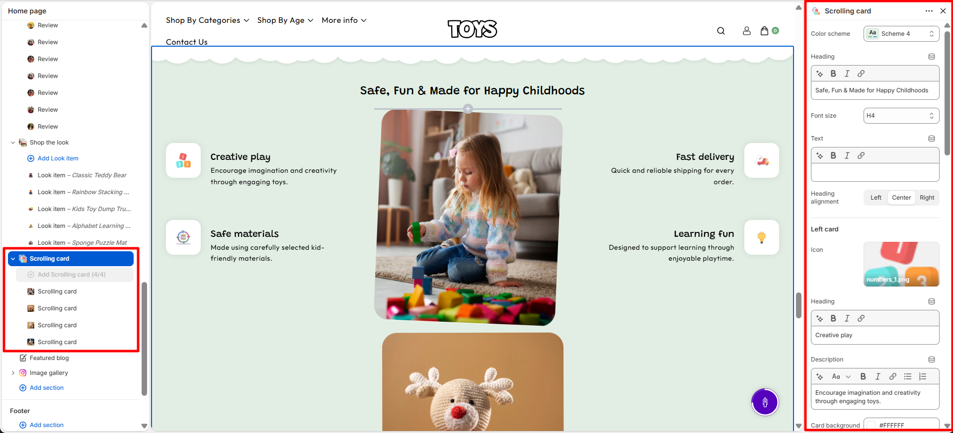
This section provides global settings to control the overall appearance and layout:
- Color Scheme – Choose a predefined color palette to match the section with your store branding.
- Heading – Add a main title for the section, such as “Safe, Fun & Made for Happy Childhoods”, to highlight your key benefits.
- Font Size – Adjust the size of the section heading text.
- Text – Add supporting content below the heading to provide additional information about the section.
- Heading Alignment – Choose the heading alignment, such as Left, Center, or Right.
- Icon – Upload an icon image to represent each feature or benefit card.
- Heading – Add a title for the feature card, such as “Creative play” or “Safe materials”.
- Description – Add a short description explaining the feature or benefit shown in the card.
- Card Background – Choose the background color for each feature card.
- Desktop Spacing – Adjust the spacing of the section for desktop devices.
- Padding Top – Set the top spacing of the section on desktop devices.
- Padding Bottom – Set the bottom spacing of the section on desktop devices.
- Mobile Spacing – Adjust the spacing of the section for mobile devices.
- Mobile Padding Top – Set the top spacing of the section on mobile devices.
- Mobile Padding Bottom – Set the bottom spacing of the section on mobile devices.
Scrolling card Block Settings
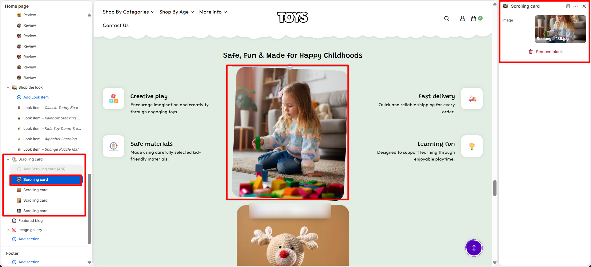
Each image in the grid has its own block settings:
- Select Image – Upload the image to display .
Steps
- Open the Theme Customizer from your Shopify admin.
- Navigate to the Scrolling card section on the homepage.
- Set the section heading, choose a color scheme, and configure spacing.
- Click Add Scrolling card to add a new image block.
- Upload the image, add a button label, and set the link destination.
- Repeat for additional images as needed.
- Adjust the number of columns per row and image overlay as desired.
- Click Save to apply your changes.
FAQs
Where can I find the Scrolling card section?
The Scrolling card section is available in the Theme Customizer. From Shopify admin, go to Online Store > Themes and click Customize. Locate the Scrolling card section on the homepage template.
How do I add or edit a multicolumn image?
Open the section in the Theme Customizer, click Add Scrolling card to add a new block, or select an existing image to edit. Upload your image, set a button label, and assign a link. Adjust layout settings such as number of columns and image overlay, then save.