
Featured Collection
The Featured Collection section in the Soft theme allows you to highlight selected products from a specific collection directly on your homepage. This section helps showcase trending, best-selling, or promotional products in an attractive grid or slider layout.
By displaying products from a chosen collection, customers can quickly discover popular items without navigating through multiple pages. Each product card includes product images, price details, discounts, and quick shopping options to improve the browsing experience.
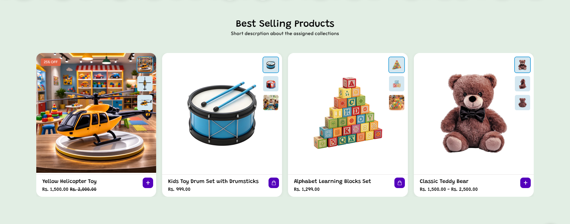
Featured Collection Settings
The Featured Collection section provides multiple customization options to control how products appear and how customers interact with them.
- Color Scheme – Select the color scheme for the section to match your store’s overall design.
- Heading – Add a section title such as “Best Selling Products” to highlight featured items from the selected collection.
- Font Size – Choose the heading style (for example H4) to define its visual hierarchy.
- Description – Add a short description about the selected collection or products displayed in this section.
- Heading Alignment – Choose how the heading is aligned (Left, Center, or Right).
- Color – Set the color for the heading or section text based on your design.
- Select Collection – Choose the product collection that will be displayed in this section.
- Products to Show – Define how many products will be displayed from the selected collection.
- Columns per Row – Set how many product cards appear in a single row on desktop view.
-
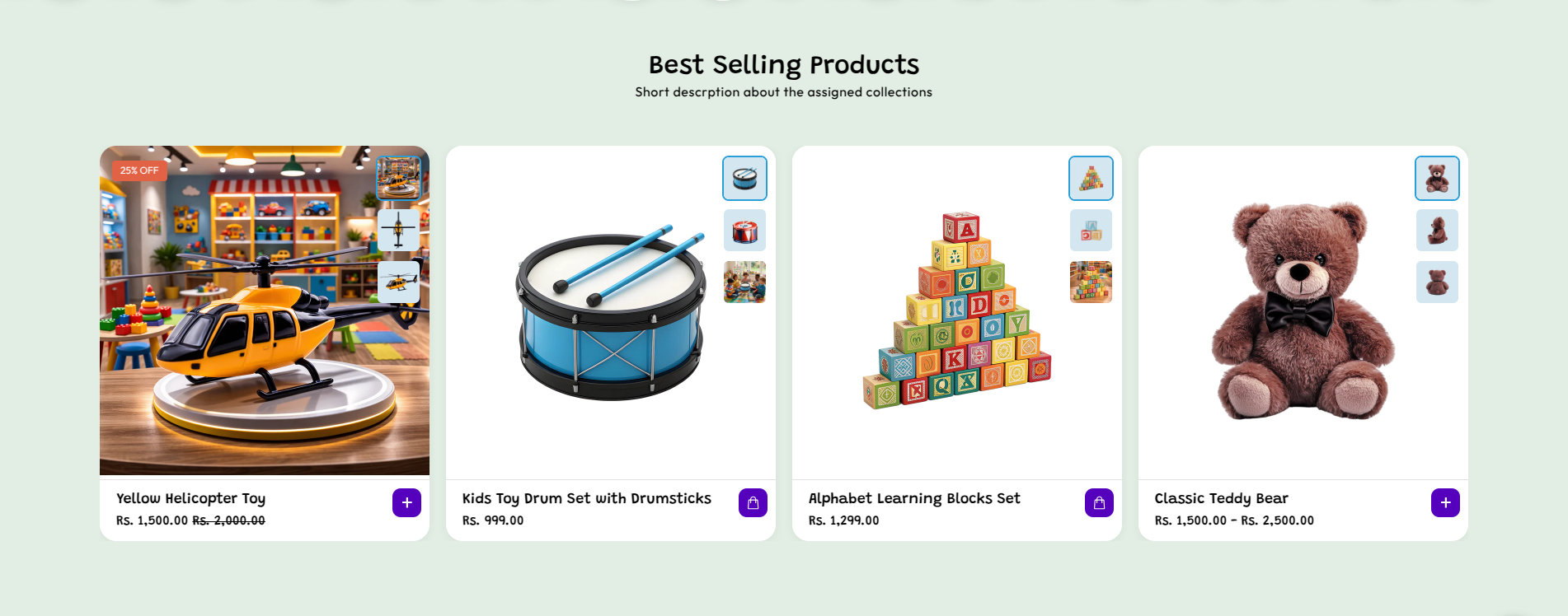
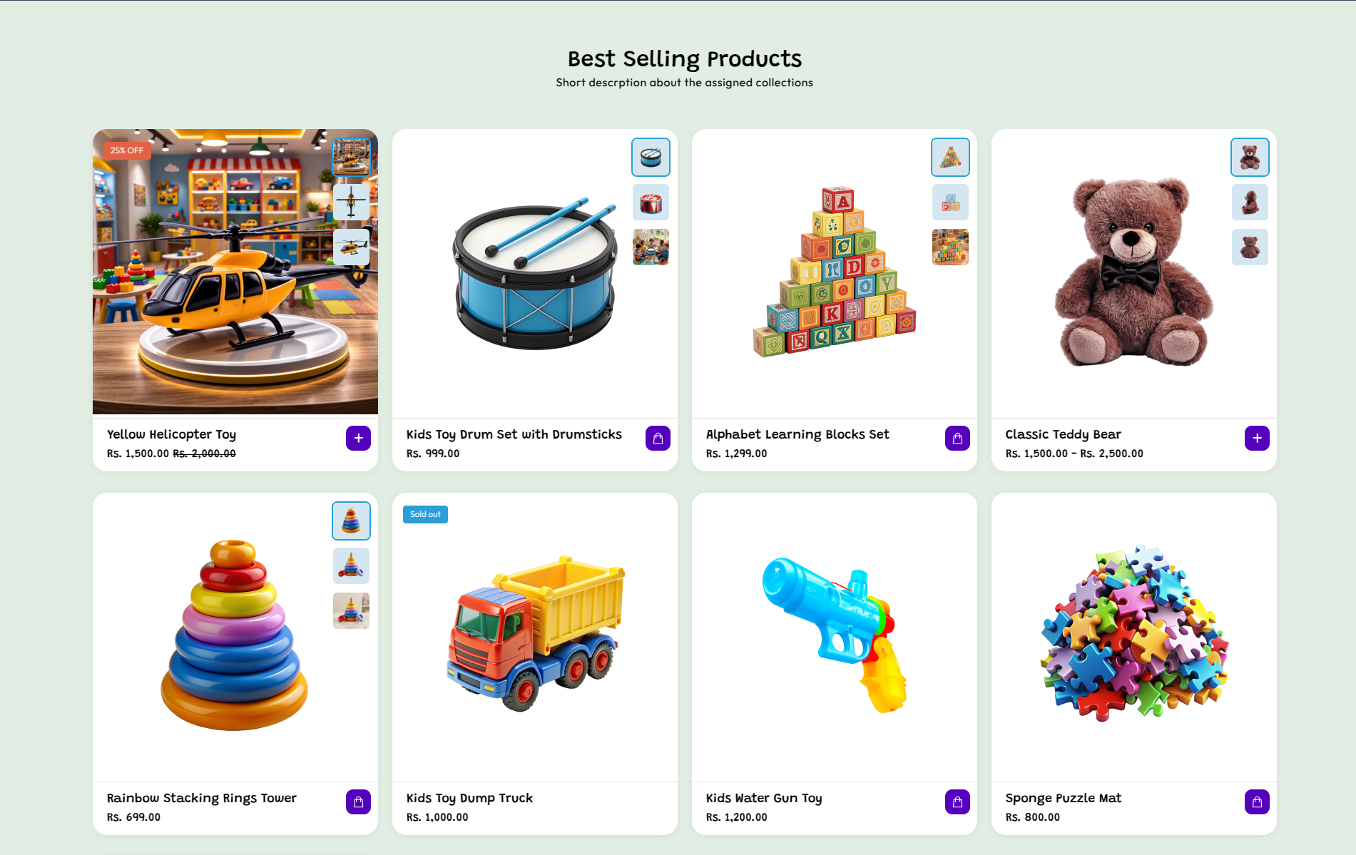
Enable Slider – Turn this on to display products in a horizontal slider format. If disabled,
products will appear in a grid layout.
-
Navigation Preview Arrow – Customize the previous arrow used in the slider navigation:
- Background – Set the background color of the previous arrow button.
- Label – Set the icon/text color inside the previous arrow button.
- Hover Background – Change background color when hovered.
- Hover Label – Change icon/text color when hovered.
-
Navigation Next Arrow – Customize the next arrow used in the slider navigation:
- Background – Set the background color of the next arrow button.
- Label – Set the icon/text color inside the next arrow button.
- Hover Background – Change background color when hovered.
- Hover Label – Change icon/text color when hovered.
- Image Aspect Ratio – Choose the shape of product images (e.g., Square) for consistent layout.
- Show Secondary Image on Hover – Enable this option to show an alternate product image when hovering over a product card.
- Show Vendor – Display the product vendor name on product cards.
- Enable Quick View – Allow customers to preview product details without opening the product page.
- Enable View All Button – Display a button that links users to the full collection page.
- Button Label – Enter the text displayed on the “View All” button (e.g., “Explore More”).
-
Desktop Spacing – Adjust spacing for desktop devices:
- Padding Top – Space above the section.
- Padding Bottom – Space below the section.
-
Mobile Spacing – Adjust spacing for mobile devices:
- Padding Top – Space above the section.
- Padding Bottom – Space below the section.
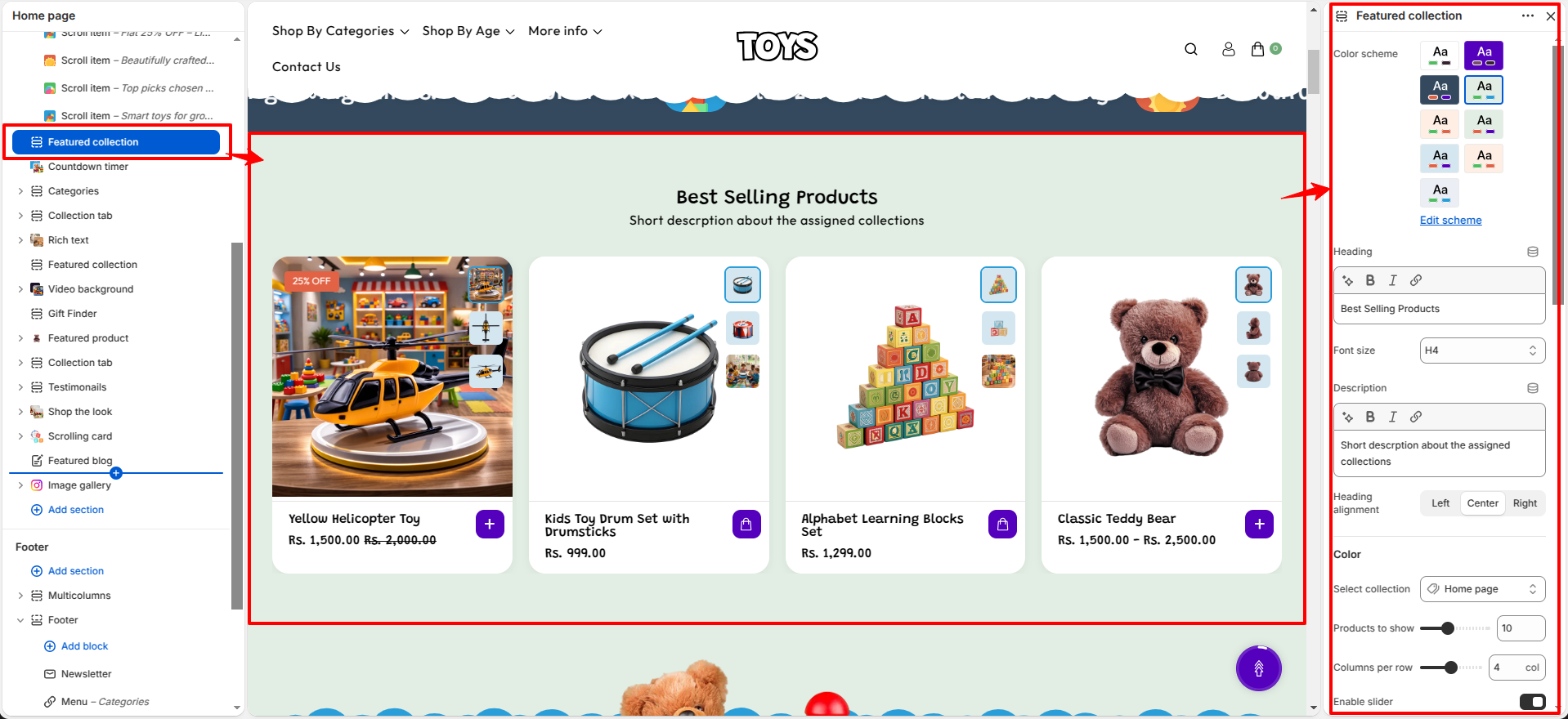
Product Card Settings
The Featured Collection section also allows you to customize how individual product cards appear to customers.
- Show Vendor – Enable this option to display the product vendor name on the product card.
- Image Aspect Ratio – Choose the image ratio (such as Square) to maintain a consistent and uniform product image layout across all product cards.
- Show Secondary Image on Hover – Display an alternate product image when a customer hovers over the product card.
- Enable Quick View – Allow customers to preview product details quickly without leaving the current page.
- Enable View All Button – Display a button that links users to the full collection page.
- Button Label – Enter the text displayed on the “View All” button (for example, “Explore More”).
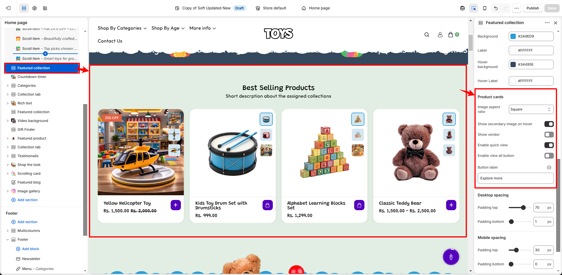
Steps
- Open the Theme Customizer.
- Navigate to the Featured Collection section on the homepage.
- Add a section heading and choose the desired color scheme.
- Select the collection from which products should be displayed.
- Configure layout options such as number of products, columns, and display type.
- Customize product card settings like quick view, secondary image, and color swatches.
- Click Save to apply the changes.
FAQs
Where can I find the Featured Collection section?
You can find the Featured Collection section in the Theme Customizer. From your Shopify admin, go to Online Store > Themes and click Customize. In the homepage template, locate the Featured Collection section to manage product display and layout settings.
How do I display products in the Featured Collection section?
To display products, open the Theme Customizer and navigate to the Featured Collection section. Select the collection you want to showcase, configure the number of products and layout options, and then click Save to apply the changes.