
Hover cards
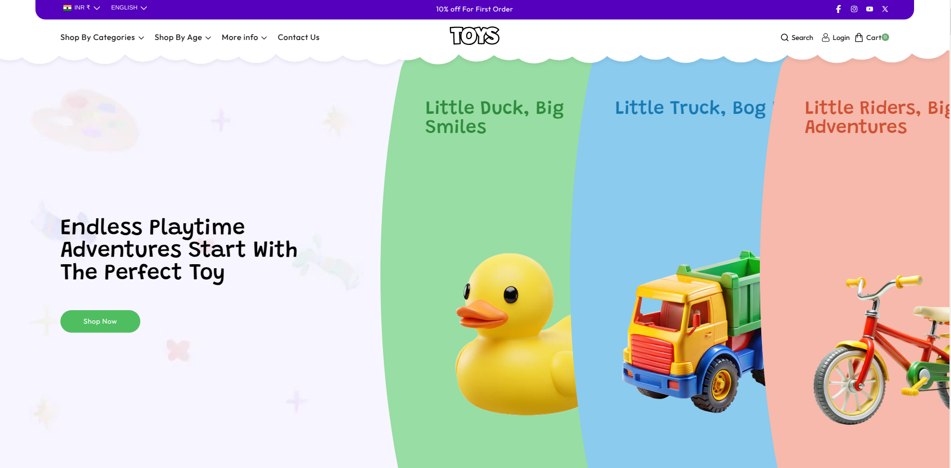
The Hover Cards section in the Soft theme is designed to create a strong visual introduction for your store. It allows you to display multiple interactive, promotions, or other important content. Each card expands on hover to reveal additional details, including a heading, description, and call-to-action button, helping customers quickly discover and engage with key areas of your store.
The Hover Cards section supports multiple cards, allowing you to highlight different collections, promotions, services, or featured content within a single section. Each card can include an image, heading, description, and button, and expands on hover to display additional details, helping customers easily discover and navigate important areas of your store.
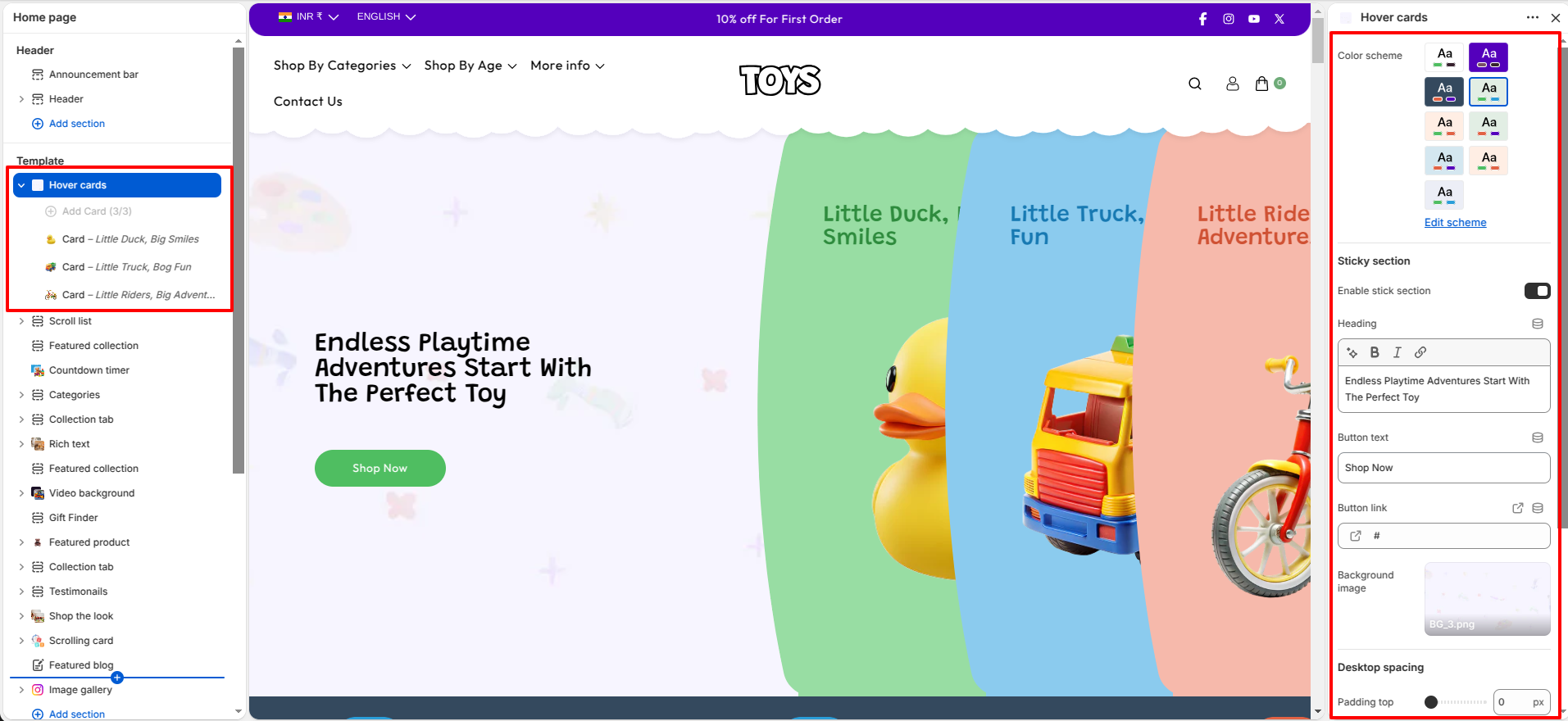
Hover cards Settings
The Soft Hover cards provides several customization options to control the appearance of the section, including banner height, background text, vertical text, and spacing adjustments.
- Color Scheme – Select the color scheme used for the section.
- Sticky Section – Enable this option to make the section remain visible while scrolling, creating a more engaging browsing experience.
- Heading – Enter the main heading text displayed in the section.
- Button Text – Specify the text that appears on the call-to-action button.
- Button Link – Add a link that customers will be directed to when the button is clicked.
- Background Image – Upload an image to display as the background of the section.
-
Desktop Spacing – Adjust the spacing for desktop devices, including:
- Top Spacing – Controls the space above the section on desktop screens.
- Bottom Spacing – Controls the space below the section on desktop screens.
-
Mobile Spacing – Adjust the spacing for mobile devices, including:
- Top Spacing – Controls the space above the section on mobile screens.
- Bottom Spacing – Controls the space below the section on mobile screens.
Hover cards Slides
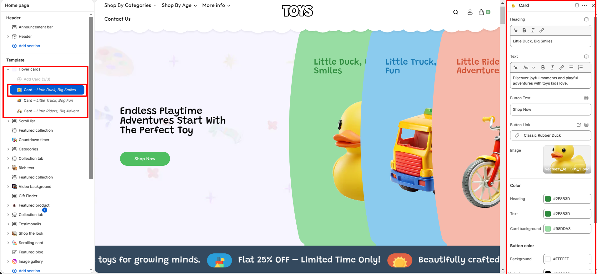
You can add multiple hover cards to this section to showcase different collections, promotions, services, or featured content. Each card can be customized individually with its own image, heading, description, and button. When a customer hovers over a card, it expands to reveal additional details, creating an interactive and engaging browsing experience.
- Heading – Enter the main title for the card that highlights the key message or promotion. This appears prominently at the top of the hover card.
- Text – Add a short description or supporting content below the heading to provide more details about the card’s message or offer.
- Button Text – Enter the label for the call-to-action button (for example, “Shop Now”) displayed inside the card.
- Button Link – Select the page, product, or collection where users will be redirected when they click the button.
- Image – Upload an image that visually represents the card content or promotion.
- Heading Color – Choose the color of the card heading text.
- Text Color – Choose the color of the description text inside the card.
- Card Background Color – Set the background color of the card to match your design style.
- Button Background Color – Select the default background color of the button.
- Button Label Color – Choose the color of the button text.
- Button Hover Background – Set the background color of the button when a user hovers over it.
- Button Hover Label Color – Choose the text color of the button when hovered.
Steps
- Open the Theme Customizer.
- Navigate to the Hover cards section on the homepage.
- Configure the section settings such as banner height, background text, and vertical text.
- Click Add Slide to create a new banner slide.
- Upload the slide image and add heading, text, and button details.
- Click Save to apply the changes.
FAQs
Where can I find the Hover cards section in the theme?
You can find the Hover cards section in the Theme Customizer. From your Shopify admin, go to Online Store > Themes and click Customize. In the homepage template, locate the Hover cards section where you can manage slides, images, headings, and button settings.
How do I add or edit slides in the Hover cards?
To add or edit slides, open the Theme Customizer and navigate to the Hover cards section on the homepage. Click Add Slide to create a new slide or select an existing slide to update its image, heading, content, and button settings. Once finished, click Save to apply the changes.