
Collection tab
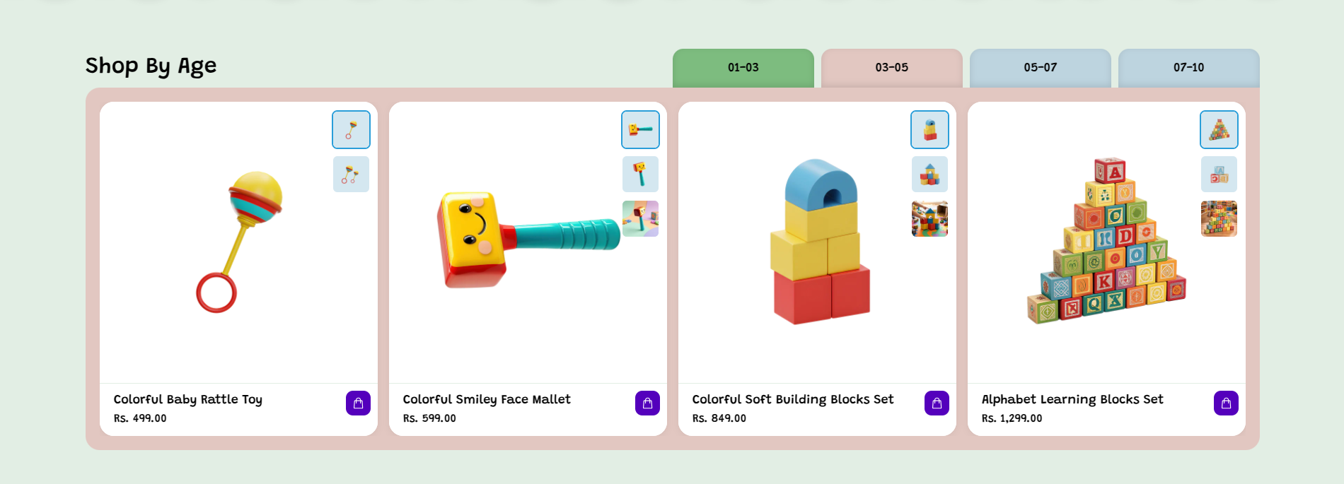
The Collection Tab section in the Toy theme allows you to display multiple product collections in a tab-based layout. Each tab can be connected to a different collection, such as age-based categories like 01-03, 03-05, 05-07, and 07-10, helping customers quickly find toys suitable for different age groups.
Each collection tab showcases related products with product images, titles, and prices in an organized product card layout. Customers can switch between tabs to explore different collections and easily browse products based on their selected category or age group.
Collection tab Settings
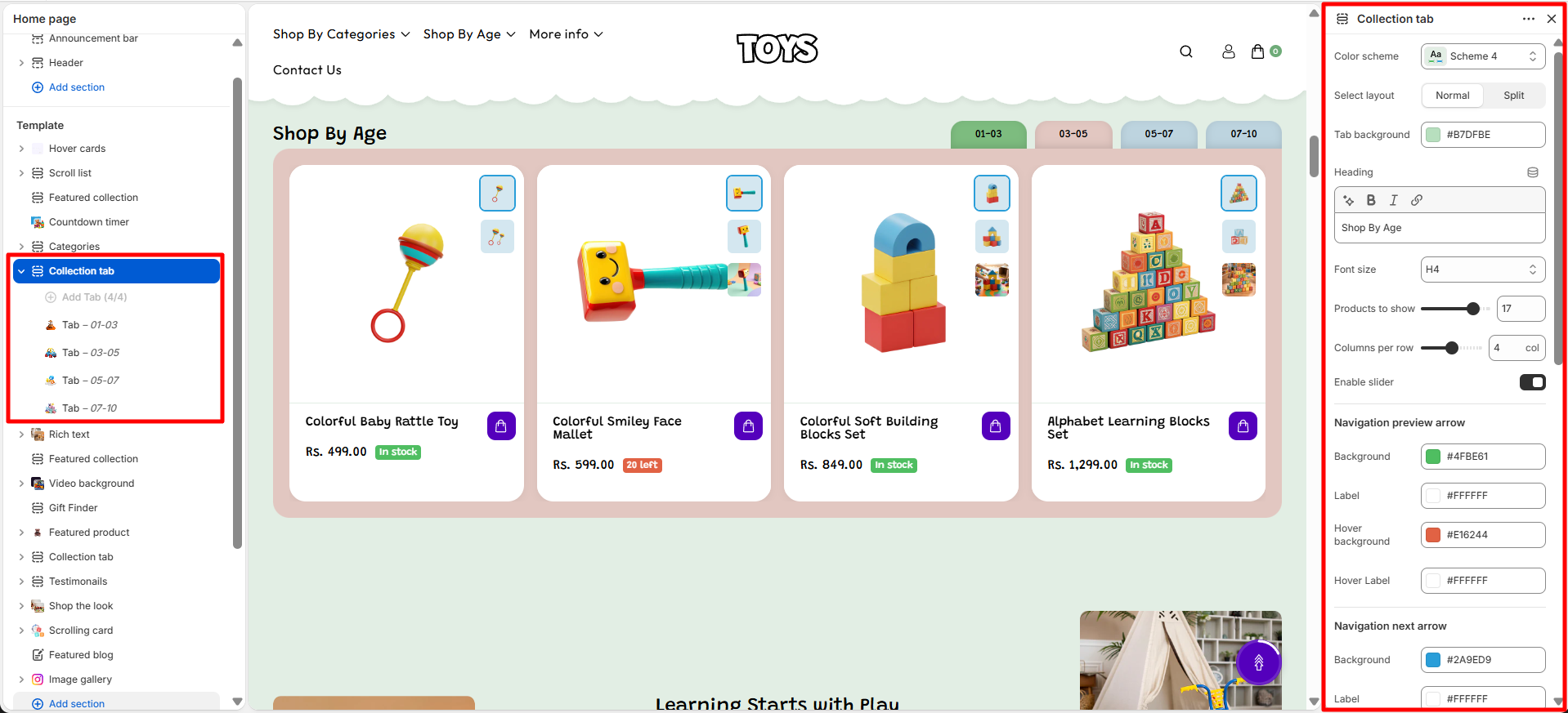
The Collection tab section provides several customization options that allow you to control the layout, design, and visibility of collections.
- Color Scheme – Select the color scheme used for the collection list section to match your store's design.
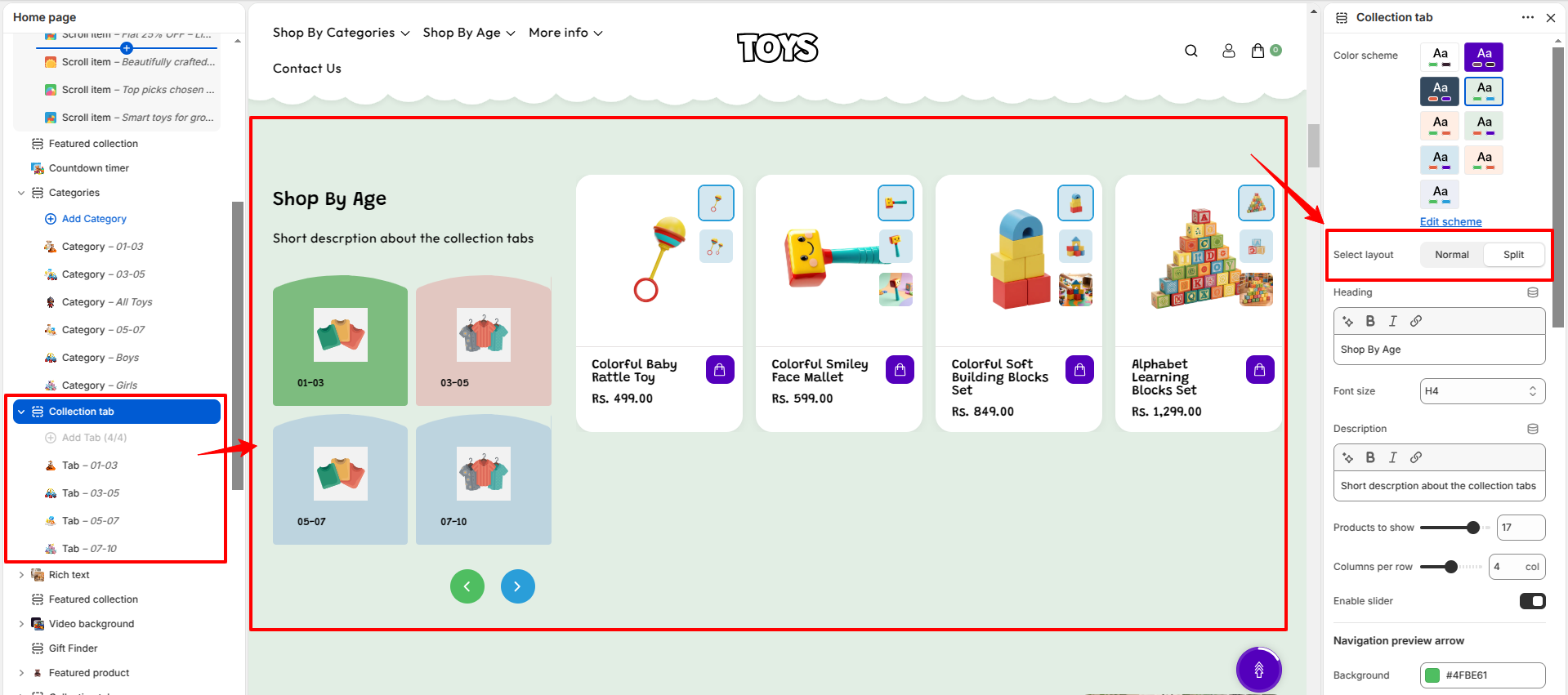
- Select Layout – Choose how the section is displayed, either Normal or Split layout.
- Tab Background – Set the background color of the tab area using a custom color value.
- Heading – Enter the main section title such as “Shop By Age”.
- Font Size – Select the heading size (e.g., H4) to control its visual hierarchy.
- Products to Show – Set how many items/products will be displayed in the section.
- Columns per Row – Define how many items appear in one row on desktop view.
- Enable Slider – Turn on slider view for horizontal scrolling of items. When disabled, items appear in grid layout.
-
Navigation Preview Arrow – Customize the previous
arrow used in slider navigation:
- Background – Set background color of the previous arrow button.
- Label – Set icon/text color inside the arrow.
- Hover Background – Change background color on hover.
- Hover Label – Change icon/text color on hover.
-
Navigation Next Arrow – Customize the next arrow
used in slider navigation:
- Background – Set background color of the next arrow button.
- Label – Set icon/text color inside the arrow.
- Hover Background – Change background color on hover.
- Hover Label – Change icon/text color on hover.
-
Product Cards – Configure how product cards appear:
- Image Aspect Ratio – Choose image shape (Square, etc.) for consistency.
- Show Secondary Image on Hover – Enable alternate image on hover.
- Show Vendor – Display product vendor name.
- Enable Quick View – Allow quick product preview without opening product page.
- Show View All – Display a “View All” button linking to full collection page.
- Button Style – Choose button style (Primary or Secondary).
-
Desktop Padding – Controls spacing on desktop
devices:
- Padding Top – Space above the section.
- Padding Bottom – Space below the section.
-
Mobile Padding – Controls spacing on mobile
devices:
- Padding Top – Space above the section.
- Padding Bottom – Space below the section.
Collection Block Settings
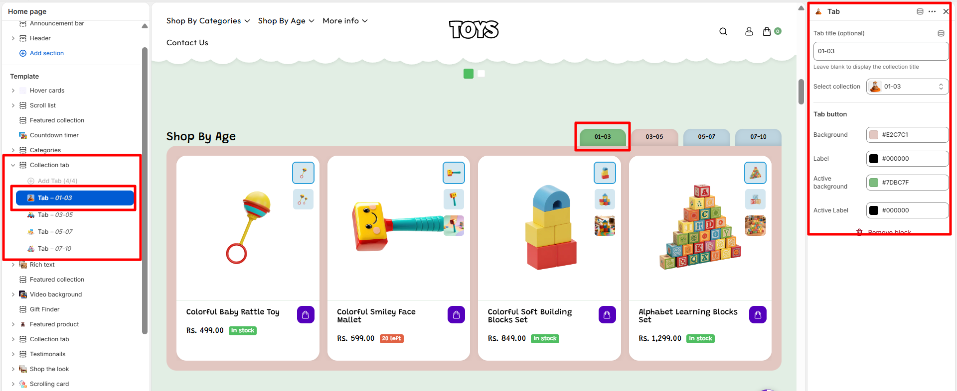
Each Collection tab can be customized individually. You can choose which collection to display, upload an image, and set the title for each collection block.
- Tab Title (Optional) – Enter a custom title for the tab. If left blank, the collection title will be displayed automatically.
- Select Collection – Choose the Shopify collection you want to display in this tab.
- Tab Button – Add a button label for the collection tab to help customers navigate between different collections.
- Background – Choose the background color for the inactive tab button.
- Label – Select the text color for the inactive tab button label.
- Active Background – Choose the background color that will be applied to the currently selected tab.
- Active Label – Select the text color for the active tab label.
Steps
- Open the Theme Customizer.
- Navigate to the Collection tab section on the homepage.
- Add a heading and configure section settings such as color scheme, alignment, and spacing.
- Click Add Collection to create a new collection block.
- Select the collection you want to display and optionally upload a custom image.
- Repeat the process to add multiple collections to the section.
- Click Save to apply the changes.
FAQs
Where can I find the Collection tab section?
You can find the Collection tab section in the Theme Customizer. From your Shopify admin, go to Online Store > Themes and click Customize. In the homepage template, locate the Collection tab section to manage collections, images, and layout settings.
How do I add collections to the Collection tab section?
To add collections, open the Theme Customizer and navigate to the Collection tab section. Click Add Collection, select the collection you want to display, and optionally upload a custom image or title. Once finished, click Save to apply your changes.