
Product Page
The Product Page is one of the most important pages in your Shopify store, as it presents a single product along with all the essential information customers need before making a purchase. In the Opulence theme, the product page is designed to highlight your product with a clean layout, high-quality media, and well-structured details that help customers easily understand the product and make confident buying decisions.
This page includes a product media gallery, product title, vendor name, pricing details, SKU, and a detailed product description. Customers can also select product variants such as size or color, check inventory availability, adjust the quantity, and add the item to their cart directly from this page. Additional blocks such as pickup availability, trust badges, complementary products, collapsible information tabs, and social share buttons can be enabled to enhance the shopping experience and provide more useful information to your customers.
How to Configure the Product Page
Steps
- From your Shopify admin, go to Online Store → Themes.
- Click Customize on the Opulence theme.
- In the Theme Editor, use the page selector dropdown and choose Products → Default product.
- From the left sidebar, select the Product section to access the product page settings.
- Add, remove, or rearrange product blocks such as Title, Price, Variant Picker, Inventory, and Add to Cart according to your store’s needs.
- Adjust the section settings and layout options available on the right panel.
- Click Save to apply your changes.
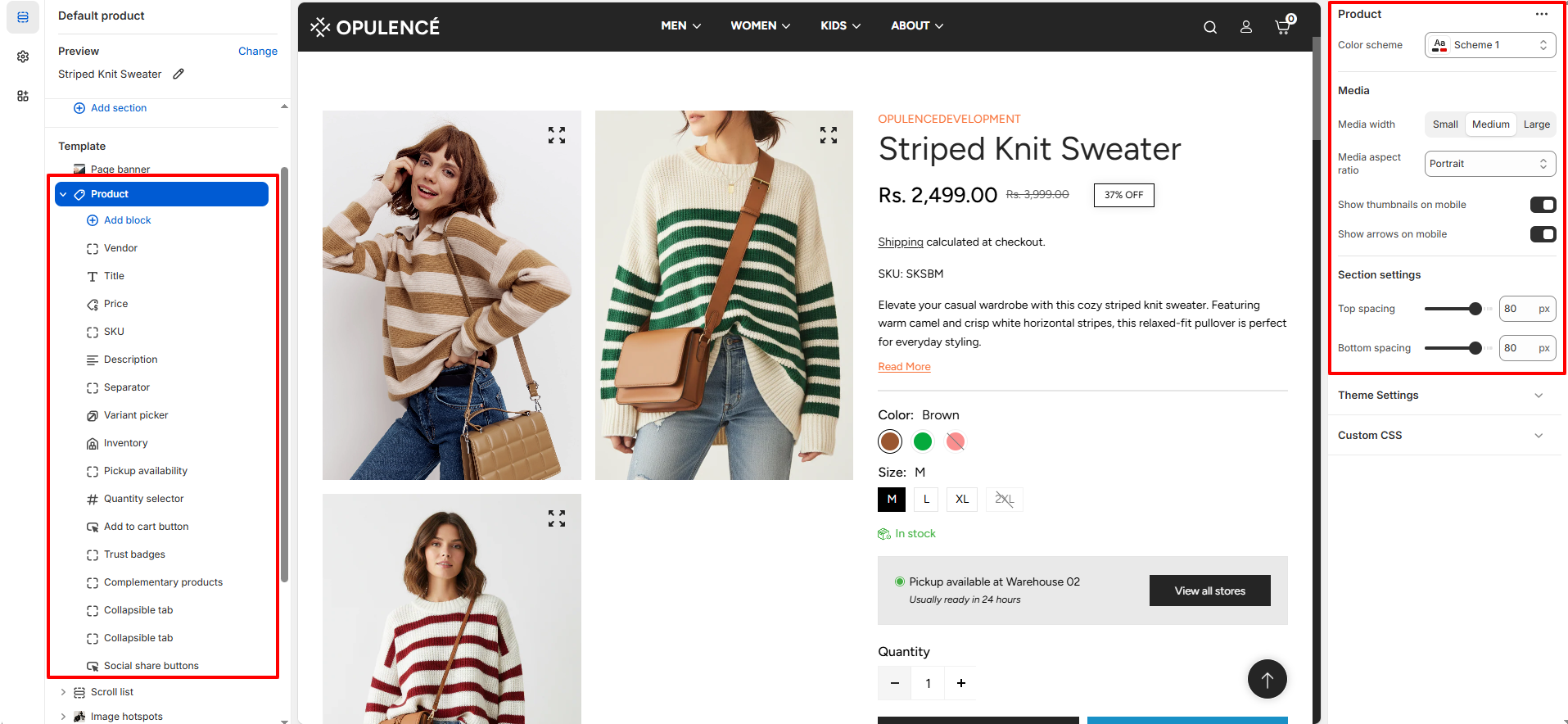
Product
The Product Information contains all the essential blocks that display details about a product. These blocks help customers understand the product, view important details, select variants, and complete their purchase easily.
How to configure Product Information
- Color Scheme: Choose from predefined color schemes (e.g., Scheme 1) to control background, text, and accent colors.
-
Media Width: Select the size of the product media gallery:
- Small: Compact display for minimalist layouts.
- Medium: Balanced size for clear visuals.
- Large: Large display for high-impact imagery.
- Media Aspect Ratio: Set the shape of product images, e.g., Portrait for vertical orientation.
- Show Thumbnails on Mobile: Display smaller preview images below the main gallery on mobile devices.
- Show Arrows on Mobile: Display navigation arrows on the media gallery for easier browsing on mobile.
Available Product Block
-
Vendor: Displays the name of the product’s brand or supplier on the product page,
helping customers easily identify the brand associated with the product.
-
Text Transform: Controls how the vendor name appears.
- Default: Shows the vendor name in its original format.
- Uppercase: Displays the vendor name in uppercase letters.
-
Color: Select the color style for the vendor text.
- Body: Uses the default theme text color.
- Highlight: Applies the highlight color to make the vendor name stand out.
-
Text Transform: Controls how the vendor name appears.
-
Title: Displays the name of the product prominently on the product page, helping
customers quickly identify the product they are viewing.
- Heading font weight: Controls the thickness of the product title text, allowing you to adjust how bold or prominent the title appears.
- Price: Displays the product’s pricing information on the product page, including the current price, compare-at price, and any discounts. This helps customers quickly see the product’s cost and any savings available.
- SKU: Displays the product’s Stock Keeping Unit (SKU) on the product page. This unique identifier helps both store owners and customers track and reference specific products efficiently.
-
Description: Shows the product’s detailed description on the product page, helping
customers understand the product features, benefits, and usage.
- Number of Lines to Show by Default: Controls how many lines of the product description are visible initially. Customers can expand to see the full description if it exceeds the set limit.
- Separator: Adds a visual divider between blocks on the product page. This helps organize content and improve readability by clearly separating different elements.
-
Variant Picker: Allows customers to choose between different product options such as
size, color, or material.
-
Options Type: Select how product variants are displayed:
- Button: Shows variants as clickable buttons, ideal for quick selection and visual clarity.
- Dropdown: Displays variants in a compact dropdown list, suitable for products with many options.
- Swatch Shape: You can change the shape of color swatches by going to Theme Settings → Swatches → Swatch Shape. This allows you to choose between round, square, or use default one.
- For more detil about swatches click on More
- For more details about swatches, refer to Shopify’s Option with swatches documentation .
- You can also refer to Adding color swatches using category metafields for advanced customization.
-
Options Type: Select how product variants are displayed:
- Inventory: Displays the product’s stock status on the product page. It shows messages like In Stock, Out of Stock, or Only 10 left, helping customers know product availability at a glance.
- Pickup Availability:Displays whether a product is available for local or in-store pickup, allowing customers to select their preferred fulfillment method easily.
- Quantity Selector: Allows customers to choose the number of items they want to purchase directly on the product page, making it easy to adjust quantities before adding products to the cart.
-
Add to Cart Button: Displays the primary action button on the product page, allowing
customers to add products to their cart.
- Show Dynamic Checkout Button: Enable this option to takes customers directly to the checkout page for faster purchase completion.
- Show Dynamic Checkout Button: Enable this option to display a Dynamic Checkout button,which lets customers skip the cart and go directly to the checkout page for a faster and smoother purchase experience.
-
Trust Badges: Displays payment icons, helping customers feel confident about making a
purchase.
- Heading: Set a title or heading for the trust badges section to give context, such as “Secure Payments” or “We Accept.”
-
Alignment: Choose how the trust badges are positioned on the page:
- Left: Aligns the badges to the left side.
- Center: Centers the badges horizontally.
- Right: Aligns the badges to the right side.
-
Complementary Products: Displays related or recommended products that pair well with
the current product, encouraging additional purchases and enhancing the shopping experience.
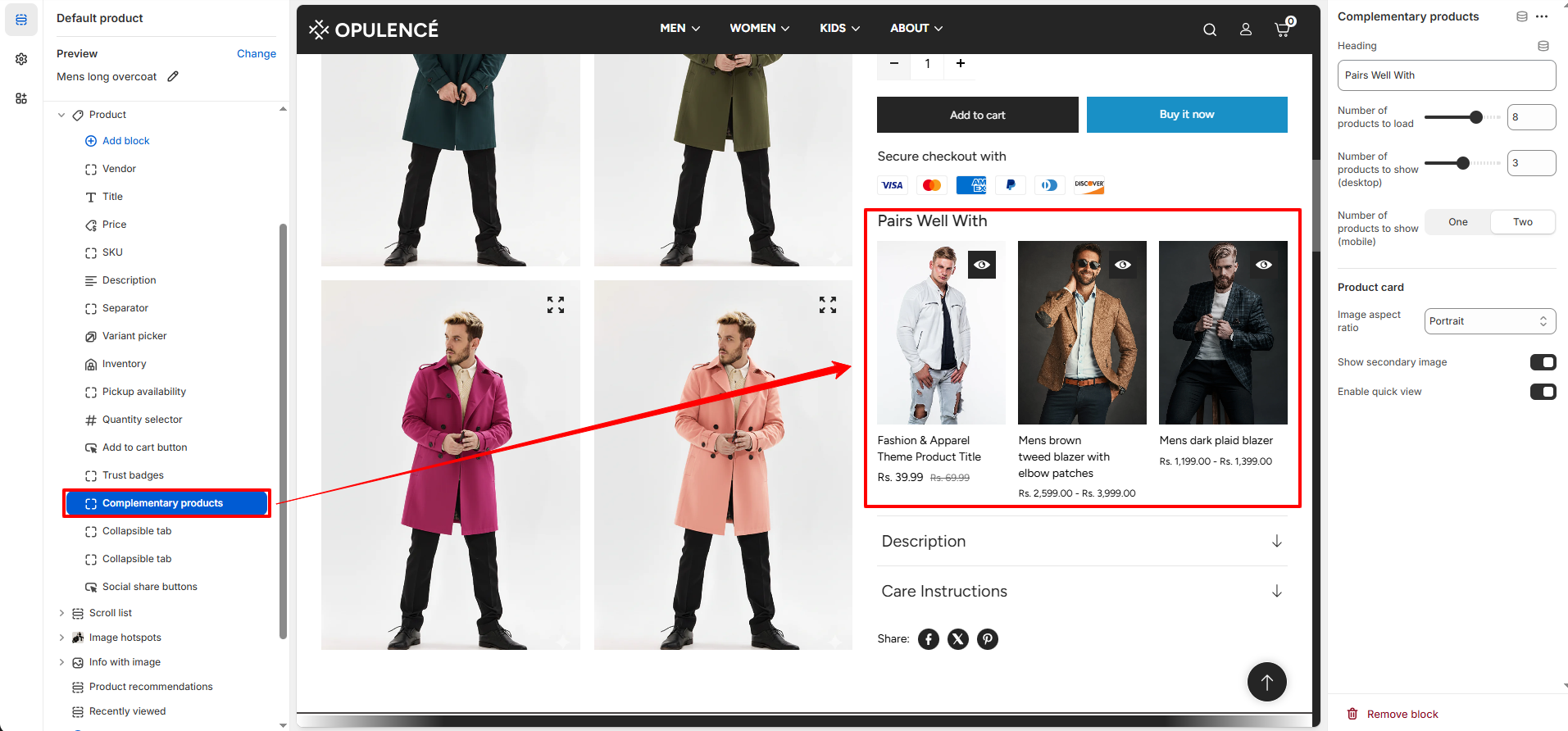
- Heading: Set the title for this section, such as “Pairs Well With,” to introduce the recommended products.
- Number of Products to Load: Controls how many complementary products are loaded in total.
- Number of Products to Show (Desktop): Sets how many products are visible at once on desktop screens.
- Number of Products to Show (Mobile): Choose to display either one or two products at a time on mobile devices for better usability.
- Image Aspect Ratio: Select the shape of the product images, such as Portrait, to maintain consistent visual presentation.
- Show Secondary Image: Enable this option to display a secondary product image on hover, providing customers with additional product views.
- Enable Quick View: Turn this on to allow customers to see a quick preview of the product without leaving the current page.
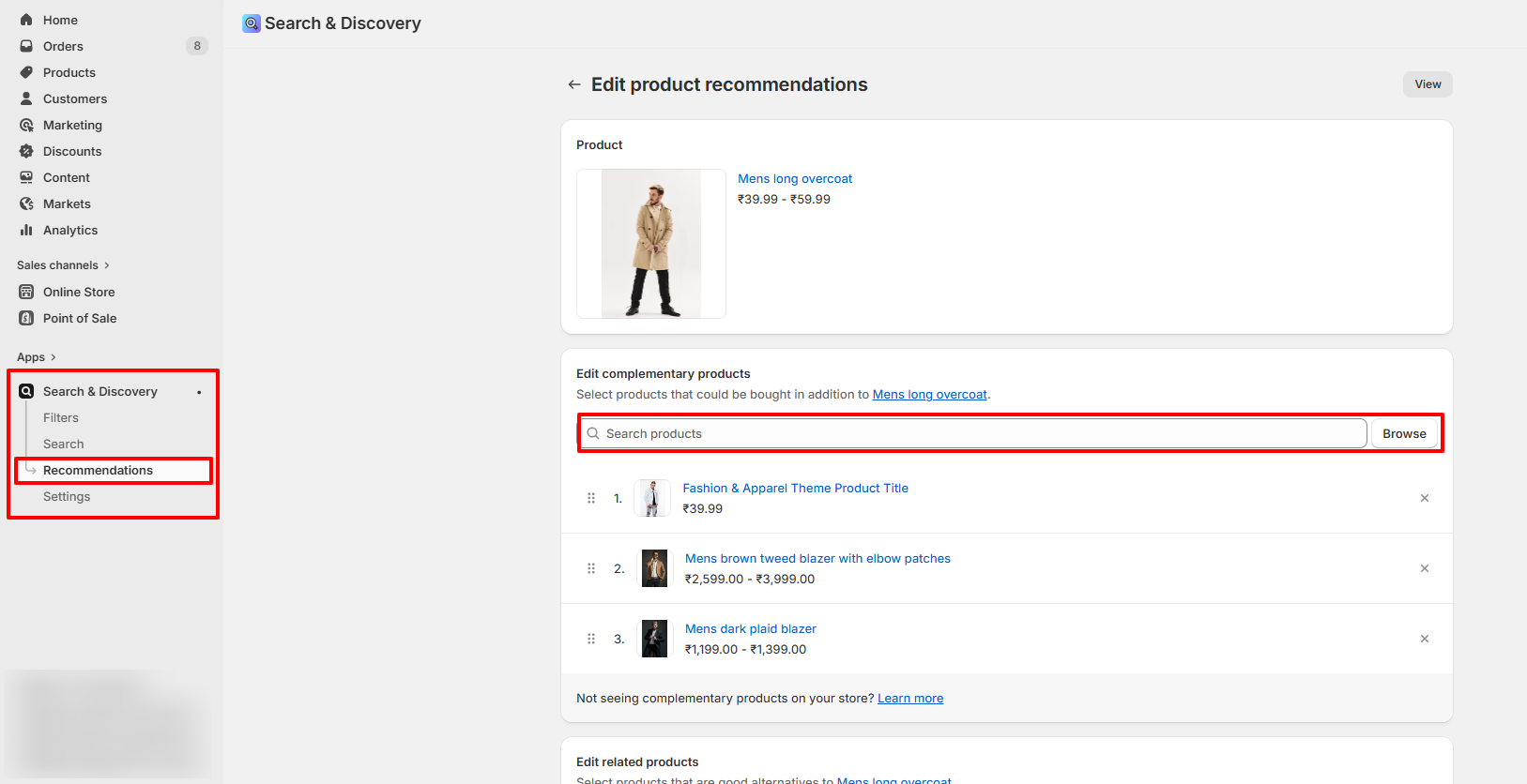
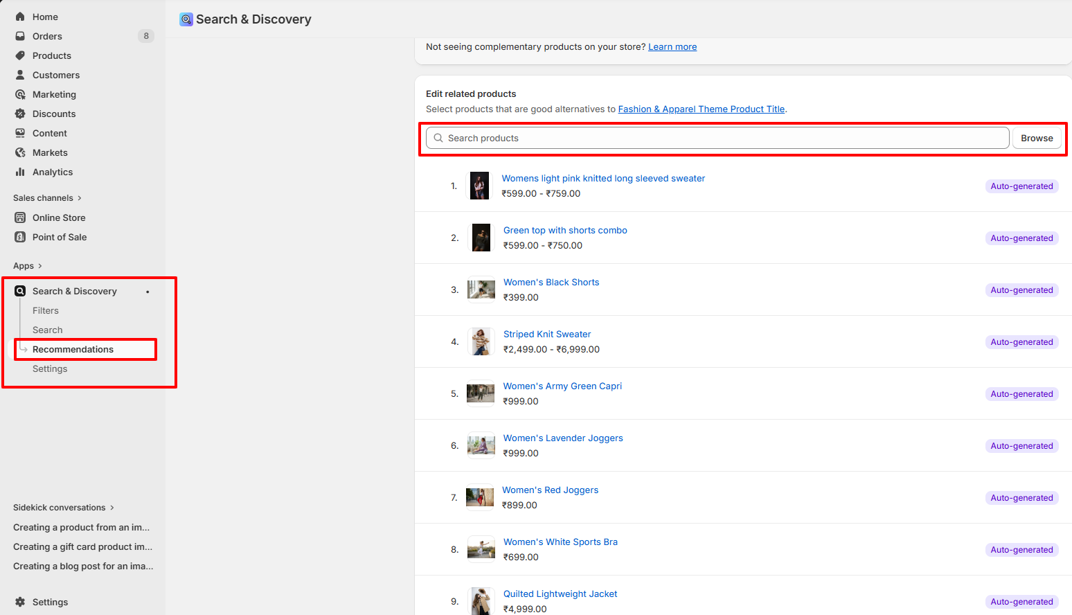
- Go to your Shopify Admin and open the Apps section.
- Select the Search & Discovery app.
- Navigate to the Recommendations feature within the app.
- Search and select the products you want to add as complementary products.
- Add the selected products as complementary items.
- Click Save to apply your changes.
How to Add Complementary Products
Steps
-
Collapsible Tab: Adds a section with a collapsible tab on the product page to
organize content neatly and save space.
- Heading: Set the title for the tab, such as “Description” or any custom heading.
- Content: Add a short description or content that explains the heading or answers a question related to the product.
- Apply Top Border: Enable to add a border line above the tab content for visual separation.
- Apply Bottom Border: Enable to add a border line below the tab content for clearer division.
- Show Product Description: When enabled, the default product description is displayed inside this collapsible tab.
- Share: Displays social media icons on the product page, allowing customers to easily share the product on platforms like Facebook, Twitter, Instagram, and more. This helps increase product visibility and reach.
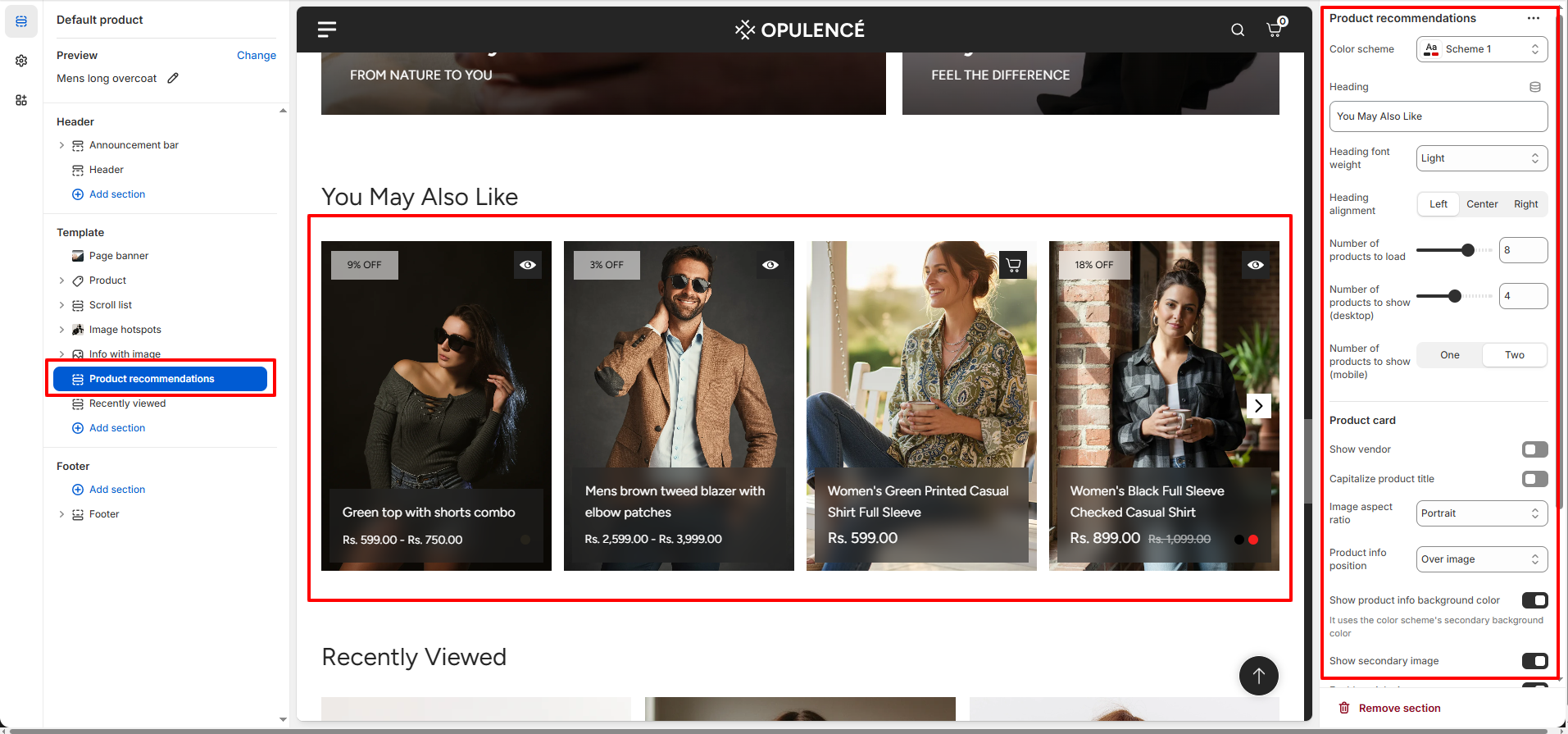
Product Recommendations
The Product Recommendations section displays suggested products related to the current item on the product page. This helps customers discover additional products they may like, increasing engagement and encouraging higher order value. In the Opulence theme, these recommendations are automatically powered by Shopify and can be configured using the Search & Discovery app.
How to Configure Product Recommendations
- Color Scheme: Select a color scheme (such as Scheme 1) to control the background, text, and accent colors of the section.
- Heading: Set the title for the recommendation section, such as You May Also Like or Recommended Products.
- Heading Font Weight: Adjust the thickness of the heading text to control how bold or light the title appears.
-
Heading Alignment: Choose the alignment of the section heading.
- Left: Aligns the heading to the left side.
- Center: Centers the heading horizontally.
- Right: Aligns the heading to the right side.
- Number of Products to Load: Controls how many recommended products are fetched in total from Shopify recommendations.
- Number of Products to Show (Desktop): Determines how many products are visible at once on desktop screens.
- Number of Products to Show (Mobile): Choose whether to display one or two products at a time on mobile devices for better responsiveness.
- Show Vendor: Enable this option to display the product vendor or brand name on the product cards.
- Capitalize Product Title: Turn on this option to automatically display product titles in uppercase format.
- Image Aspect Ratio: Set the shape of the product images displayed in the recommendation cards, such as Portrait for vertical images.
-
Product Info Position: Controls where the product information (title and price)
appears in the
product card.
- Over Image: Displays product information overlayed on the product image.
- Below Image: Displays product details below the product image.
- Show Product Info Background Color: Enable this option to apply a background color behind the product information area for better readability.
- Show Secondary Image: Displays a second product image when customers hover over the product card, giving them another view of the product.
- Enable Quick View: Allows customers to preview the product in a quick view popup without leaving the current page.
- Show Color Swatches: Displays available color variants as swatches on the product card if the product has color options.
- Section Spacing: Adjust the top and bottom spacing of the section to control the distance between this section and other sections on the page.
How to Configure Product Recommendations in Shopify Search & Discovery
Steps
- Go to your Shopify Admin.
- Navigate to Apps and open the Search & Discovery app.
- Click on the Recommendations section inside the app.
- Select a product for which you want to configure recommendations.
- Add related or recommended products that should appear on the product page.
- Save the changes to apply the recommendations.
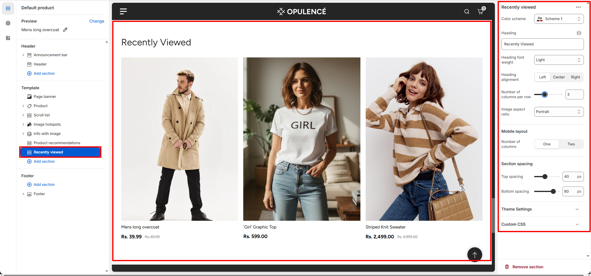
Recently Viewed
The Recently Viewed section displays products that customers have recently viewed while browsing your store. This feature helps customers quickly return to items they were interested in, improving navigation and increasing the chances of completing a purchase. The section automatically updates based on the customer's browsing history and shows the most recently viewed products on the product page.
How to Configure Recently Viewed
- Color Scheme: Choose a color scheme (such as Scheme 1) to control the background, text, and accent colors of the section.
- Heading: Set the title for the section, such as Recently Viewed or any custom heading you prefer.
- Heading Font Weight: Adjust the thickness of the heading text to control how bold or light the title appears.
-
Heading Alignment: Choose the alignment of the section heading.
- Left: Aligns the heading to the left side.
- Center: Centers the heading horizontally.
- Right: Aligns the heading to the right side.
- Number of Columns per Row: Controls how many products are displayed in a single row on desktop screens.
- Image Aspect Ratio: Select the shape of the product images displayed in the product cards, such as Portrait for vertically oriented images.
-
Mobile Layout: Choose how many products appear in each row on mobile devices.
- One Column: Displays one product per row for a larger and clearer view.
- Two Columns: Displays two products per row for a more compact layout.
- Section Spacing: Adjust the top and bottom spacing to control the distance between this section and other sections on the page.
How Recently Viewed Products Work
- The Recently Viewed section automatically tracks the products that a customer visits while browsing your store.
- When a customer views multiple products, those items are saved in the browser and displayed in this section.
- The products appear in order of the most recently viewed items.
- No manual configuration is required for selecting products, as the section dynamically updates based on the customer's browsing activity.
FAQs
Why are my product images not displaying correctly?
This usually happens when the image aspect ratio in the product section settings does not match the uploaded image size. Try adjusting the Image Aspect Ratio in the product page settings or upload images with consistent dimensions for the best display.
Why can't I see the Recently Viewed products?
Recently viewed products only appear after a customer has browsed multiple products in the store. If you are testing the feature, open a few different product pages and then return to a product page to see the section populate automatically.
Can I change the order of blocks on the product page?
Yes. In the Theme Editor, open the product template and simply drag and drop the blocks in the left sidebar to rearrange them in the order you want them to appear on the product page.