Info With Image
The Info With Image section in the Opulence theme allows you to showcase visual content along with promotional text to highlight products, collections, or brand stories.
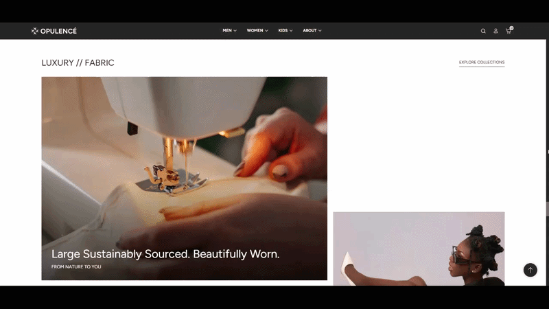
This section displays two image blocks in a flexible layout where one image appears larger and the other appears smaller. Each block can contain a heading, subheading, and optional button to guide customers to specific pages or collections.
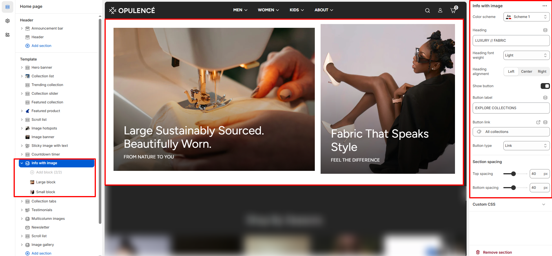
Info With Image Section Settings
- Color Scheme – Select the color scheme used for the section background and text styles.
- Heading – Enter the main heading displayed above the image blocks. Example: “Luxury // Fabric”.
- Heading Font Weight – Adjust the thickness of the heading text such as light, regular, or bold.
- Heading Alignment – Choose the alignment for the section heading (Left, Center, or Right).
- Show Button – Enable or disable the call-to-action button displayed below the section heading.
- Button Label – Enter the text displayed on the button (for example: “Explore Collections”).
- Button Link – Select the page, collection, or product where users will be redirected when they click the button.
- Button Type – Choose the style of the button displayed in the section.
- Section Spacing – Adjust the spacing above and below the section to maintain proper layout spacing across the page.
- Top Spacing – Controls the space above the section.
- Bottom Spacing – Controls the space below the section.
Info With Image Available Blocks
The Info With Image section supports two different block types that allow you to create an engaging visual layout.
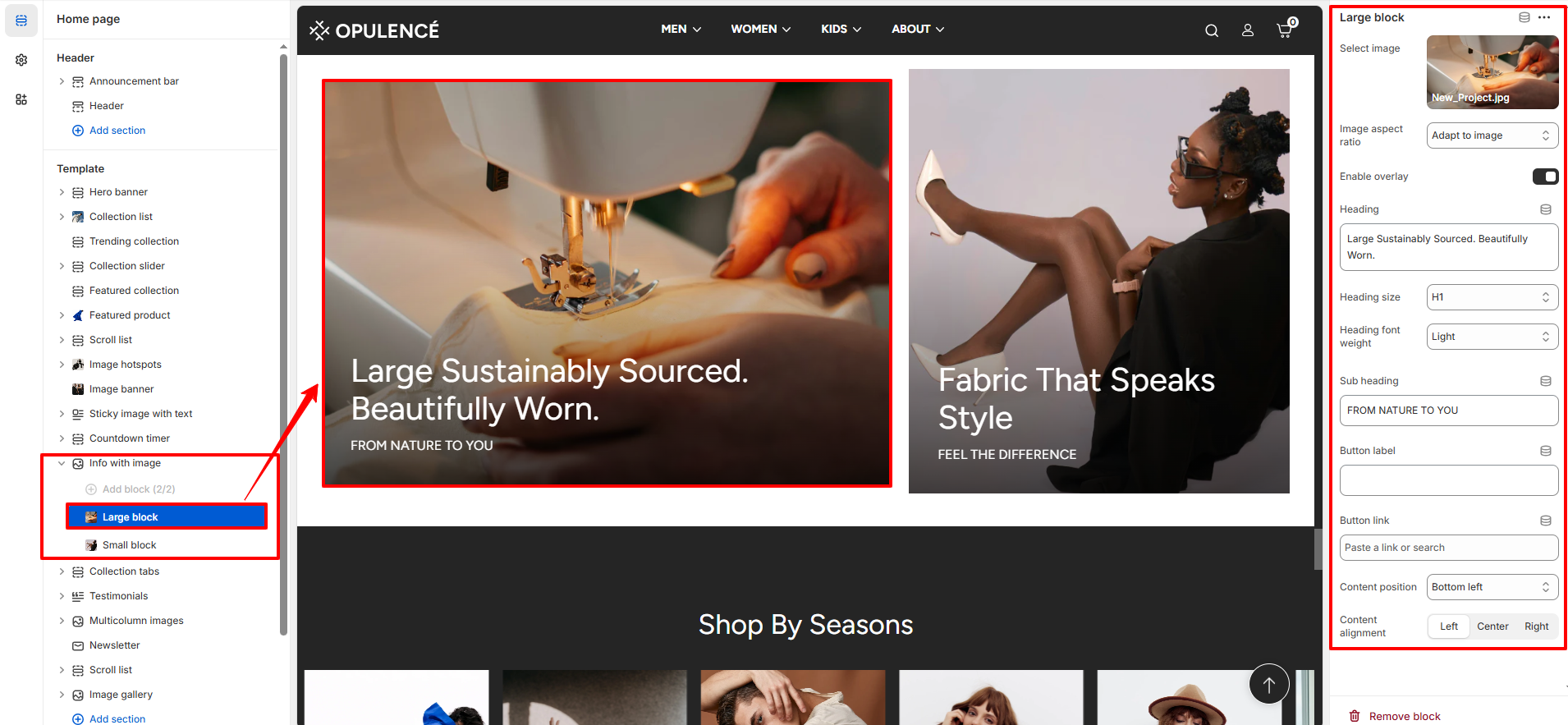
Large Block
The Large Block displays a wide image with text overlay. It is typically used to highlight key promotions, featured collections, or brand messages.
- Select Image – Upload or choose the main image displayed in the large block.
- Image Aspect Ratio – Adjust how the image fits inside the block (for example: adapt to image).
- Enable Overlay – Enable a color overlay over the image to improve text visibility.
- Heading – Enter the main heading displayed on top of the image.
- Heading Size – Select the size of the heading text.
- Heading Font Weight – Adjust the thickness of the heading text.
- Sub Heading – Enter supporting text that appears below the main heading.
- Button Label – Add text for the button displayed on the image.
- Button Link – Select the page or collection where the button will redirect.
- Content Position – Choose where the text appears on the image (for example: bottom left).
- Content Alignment – Adjust text alignment inside the block (Left, Center, or Right).
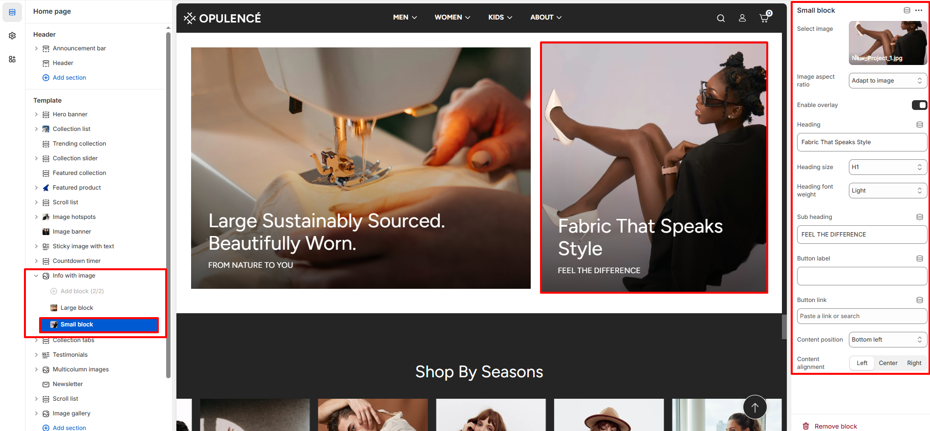
Small Block
The Small Block works similarly to the large block but appears in a smaller layout beside the main image. It is useful for promoting secondary collections or featured categories.
- Select Image – Upload or choose the image displayed in the small block.
- Image Aspect Ratio – Adjust how the image fits inside the block.
- Enable Overlay – Enable an overlay effect to improve text readability.
- Heading – Enter the main heading displayed over the image.
- Heading Size – Choose the size of the heading text.
- Heading Font Weight – Adjust the thickness of the heading text.
- Sub Heading – Add supporting text below the main heading.
- Button Label – Enter the text displayed on the button.
- Button Link – Select where the button should redirect users.
- Content Position – Choose the position of text inside the block.
- Content Alignment – Adjust the alignment of text content (Left, Center, or Right).