
Header section
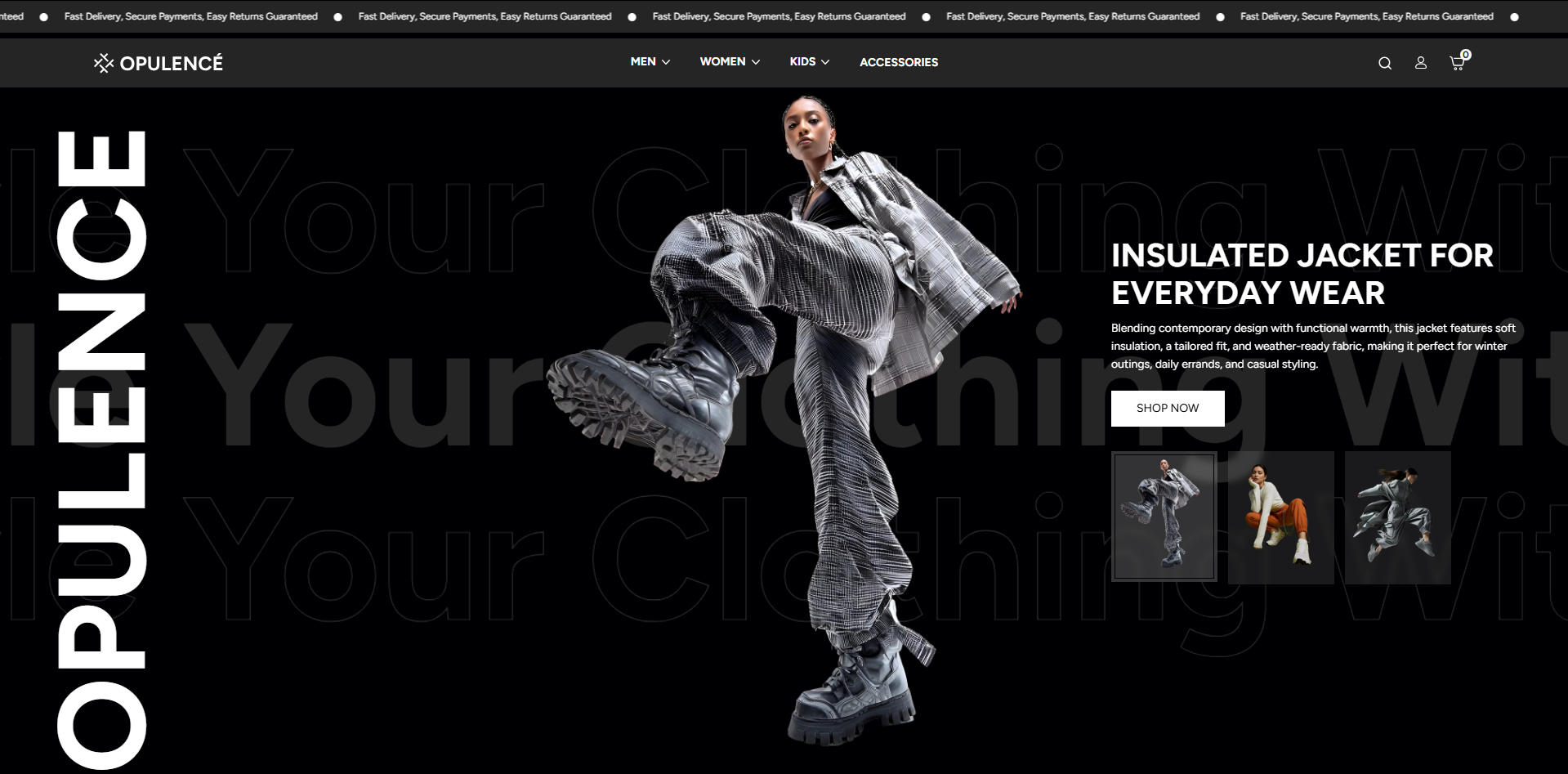
The Headeris the first point of contact for your customers, making it essential for creating a lasting impression and reinforcing your brand identity. With Opulence, you have full control over your header's layout and design, offering various options that seamlessly integrate with your store’s aesthetic.
The header includes elegantly designed icons for easy access to the cart, customer account, and search functionalities. To elevate your store’s navigation, Opulence offers separate guides for configuring the Announcement Bar, Dropdown Menu, and Mega Menu, ensuring a streamlined experience for your customers.
Steps to Set Up the Header Section in Your Shopify Theme, Opulence
How to Configure the Header
Steps
- From your Shopify admin, go to Online Store → Themes.
- Click Customize on the Opulence theme.
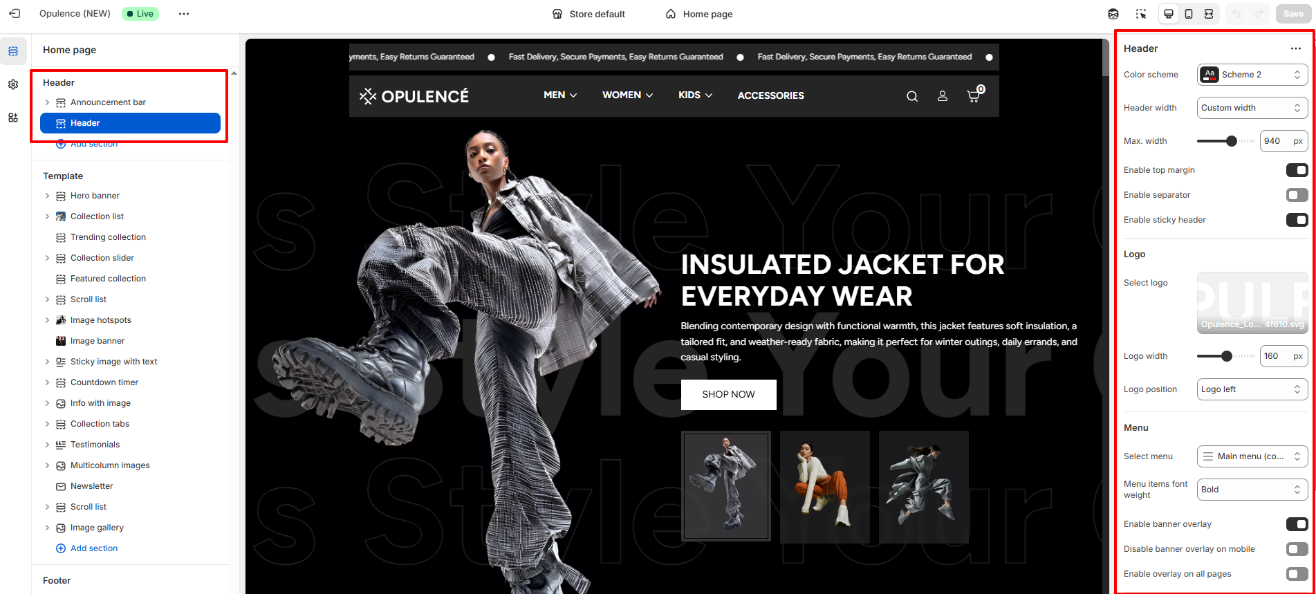
- In the Theme Editor, select the Header section from the left sidebar.
- Adjust the settings, blocks, and layout options according to your preferences.
- Click Save to apply your changes.
Follow these steps to configure your Header
- Color Scheme: Choose a color scheme to control the background and text colors of the header section.
-
Header Width: Select how wide the header content should appear.
- Full Width: The header stretches across the full screen width.
- Custom Width: Allows you to set a custom maximum width for the header layout.
- Max Width: When Custom Width is selected, use the slider to adjust the maximum width of the header (for example, 940px).
- Enable Top Margin: Enable this option to add space above the header, creating better visual separation from the top of the page.
- Enable Separator: Turn this option on to display a thin divider line below the header.
- Enable Sticky Header: When enabled, the header remains fixed at the top of the screen while users scroll through the page.
-
Select Logo:
- Upload your store logo using the Select logo option.
- For best results, use a high-quality SVG or PNG image.
- Logo Width: Adjust the size of the logo displayed in the header using the width slider (for example, 160px).
-
Logo Position: Choose where the logo appears within the
header layout.
- Logo Left – Displays the logo on the left side.
- Logo Center – Displays the logo in the center.
- Logo Center, Menu Bottom – Displays the logo in the center with the navigation menu placed below the logo.
- Select Menu: Choose the main navigation menu that will appear in the header (for example, Main Menu).
- Menu Items Font Weight: Control the thickness of the navigation menu text.
- Enable Banner Overlay: Enable this option to allow the header to appear on top of the homepage banner or hero section.
- Disable Banner Overlay on Mobile: Enable this option if you want to disable the overlay effect on mobile devices for better readability.
- Enable Overlay on All Pages: Turn this option on if you want the overlay effect to appear across all pages of your store. When enabled, your header will sit on top of any content, such as banners, images, videos, slideshows, or other sections, creating a sleek, modern look. If this option is turned off, the header will appear separately above the page content, without overlapping it. This is useful if you want the header to remain clearly distinct from your page sections or if overlapping content affects readability.
-
Customer Account Menu: Select the menu that will appear
when customers click the account icon in the header.
- This menu can include links such as Contact, Blog, FAQs, About, and Profile.
- The menu helps customers quickly navigate important account-related pages.
FAQs
How can I set up my navigation and mega menu?
Setting up your navigation and mega menu is a breeze! Check out our comprehensive Mega Menu Guide for detailed, step-by-step instructions to create a visually stunning and functional menu layout.
Why isn’t my mega menu displaying an image?
Ensure that an image has been uploaded in the Mega Menu block and that it is properly saved and linked.